Trending Colors of 2026: 10 Shades Defining the Year’s Aesthetic
From fashion and beauty to weddings and design, these are the colors setting the mood for 2026.
Some trends whisper. Others make sure you notice them.
2026 is doing both. 👀🎨
This year’s color palette is mixing soft neutrals, muted pinks, earthy greens and deep, rich browns. Think less “look at me!” and more “wait… why does that color look so good?” 😂
And these shades aren’t staying in one category. We’re talking clothes, nails, makeup, weddings, accessories, branding, décor and everything in between.
So if you’ve been wondering what colors are trending in 2026, we narrowed it down to 10 shades worth knowing.
And yes, you’re probably already wearing at least one of them.
🎨 What Colors Are Trending in 2026?
The trending colors of 2026 are leaning warm, earthy and sophisticated, with muted shades sitting right alongside deeper statement colors.
Our 2026 palette includes Velvet Beige, Dusty Rose, Mocha Brown, Cream Latte, Soft Olive, Cocoa Sand, Warm Taupe, Midnight Espresso, Blush Nude and Ivory Glow.
Translation? 2026 wants color, just with a little more attitude and a lot less chaos.
Let's get into it. 👇
Why Are These Colors Trending in 2026? 👀🎨
So, who decided brown, dusty pink and olive green were suddenly having a moment? 😂
The 2026 color trends are shifting toward shades that feel warmer, softer and easier to mix, with rich browns, muted pinks, earthy greens and creamy neutrals showing up across fashion, beauty, weddings, design and everyday style.
And there's actual trend forecasting behind it. Pantone's Spring/Summer 2026 New York Fashion Week report includes colors such as Dusty Rose, Coffee Bean, Sage Green, Angora and White Onyx. While those aren't exact matches for every shade on our list, they reflect the same overall color direction.
That's why Mocha Brown, Soft Olive, Blush Nude, Midnight Espresso, Ivory Glow and the rest of our palette make sense together. 2026 isn't being defined by one “it” color. It's about creating combinations that feel fresh without trying too hard.
Want to see where some of the inspiration is coming from? Check out the Pantone Spring/Summer 2026 Color Trend Report.
01. Velvet Beige 🤎
Beige Got an Upgrade
Color inspiration: #D8C7B2
We know what you’re thinking.
Beige is trending? Again? 😂
Yes, but Velvet Beige isn't giving boring office walls.
It's softer, warmer and creamier, landing somewhere between classic beige, light taupe and cream. That makes it easy to work into just about anything without looking like you're trying too hard to follow a trend.
Pantone's 2026 fashion forecast even includes Angora, a soft beige shade, among its seasonless colors for Spring/Summer 2026.

Where You'll See Velvet Beige in 2026
Expect this type of warm neutral to show up across fashion, handbags, shoes, nails, wedding details, accessories and minimalist branding.
But the combinations are what make it feel current.
Velvet Beige + Mocha Brown = rich and polished.
Velvet Beige + Dusty Rose = soft and romantic.
Velvet Beige + Midnight Espresso = neutral with a little drama.
Basically, beige didn't go out of style. It just learned how to dress better. 😂
💬 Are you choosing Velvet Beige or sticking with classic white?
02. Dusty Rose 🌹
Pink Is Growing Up
Color inspiration: #C89AA1
Bright pink had its moment.
Now we're turning the volume down.
Dusty Rose keeps the softness of pink but adds a muted, slightly earthy finish that makes it much easier to pair with the browns, creams and greens trending alongside it.
And this one has some serious 2026 backup. Pantone specifically included Dusty Rose in its Spring/Summer 2026 New York Fashion Week color trend report.

Where You'll See Dusty Rose in 2026
Think dresses, handbags, nails, lipstick, flowers, wedding palettes, invitations, accessories and graphic design.
And don't automatically pair it with white.
Dusty Rose + Mocha Brown feels rich and romantic.
Dusty Rose + Ivory Glow keeps things soft.
Dusty Rose + Soft Olive is the unexpected combination we didn't know we needed. 👀🌿
That's one of the biggest things to know about the 2026 color trends: many of these shades aren't completely new.
The combinations are.
💬 Would you wear Dusty Rose, use it for your nails or save it for a wedding palette?
Next Up: Things Are Getting Richer ☕👀
We've started soft, but don't get too comfortable.
Next we're getting into Mocha Brown and Cream Latte, two shades proving that brown a03. Mocha Brown 🤎
03. Brown Is Officially More Than a Basic Neutral
Color inspiration: #6B4E3D
If you've been seeing brown everywhere lately, you're not imagining it.
Mocha Brown is rich, warm and polished without feeling as harsh as black. And in 2026, brown isn't just the color you grab when you don't know what else to wear. It's becoming the whole look.
That direction is backed by the runways, too. Pantone included Coffee Bean, a deep roasted brown, in its Spring/Summer 2026 New York Fashion Week palette.
Where You'll See Mocha Brown in 2026
Expect Mocha Brown across clothing, leather handbags, boots, sunglasses, nails, makeup, wedding palettes, accessories and branding.
And don't be afraid to mix brown with more brown. 👀
Mocha Brown + Cream Latte = expensive-looking without trying.
Mocha Brown + Dusty Rose = soft with a little depth.
Mocha Brown + Soft Olive = earthy and effortlessly put together.
Mocha Brown + Ivory Glow = clean, warm and classic.
Black will always have a place, but brown is giving it some serious competition.
💬 Be honest: are you reaching for a brown outfit before a black one yet?
04. Cream Latte ☕🤍
Because Stark White Isn't the Only Neutral in the Group Chat
Color inspiration: #EADBC8
If Mocha Brown is the espresso, Cream Latte is definitely the foam on top. 😂☕
It's lighter than beige, warmer than bright white and has just enough creaminess to keep it from looking stark.
That's what makes this shade so easy to use. Cream Latte doesn't need to be the star to make everything around it look better.
The broader trend toward softened neutrals is showing up in major 2026 forecasts as well. Pantone's Spring/Summer 2026 palette includes Angora, a soft beige, while White Onyx appears among its seasonless core shades.
Where You'll See Cream Latte in 2026
This is the shade to watch across matching sets, dresses, sneakers, handbags, manicures, wedding details, invitations, packaging and minimalist designs.
And because it's so neutral, the color combinations are almost endless.
Cream Latte + Mocha Brown = coffee shop chic. ☕
Cream Latte + Soft Olive = warm and earthy.
Cream Latte + Dusty Rose = romantic without being overly pink.
Cream Latte + Midnight Espresso = soft meets dramatic.
If you love neutrals but want something warmer than plain white, Cream Latte might be your 2026 color.
💬 Which are you picking: crisp white or Cream Latte?
☕ Wait... Why Is 2026 Starting to Look Like a Coffee Order?
Mocha Brown. Cream Latte. Cocoa Sand. Midnight Espresso.
At this point, our color palette could come with an extra shot. 😂
But there's actually a bigger trend happening here. Warm browns and softened neutrals are creating the foundation of the 2026 color aesthetic, while shades like Dusty Rose and Soft Olive bring in color without completely changing the mood.
And we're about to add some green.
05. Soft Olive 🌿
Green Is Staying, But It's Softening Up
Color inspiration: #7A8466
Green has been hanging around for a while, but 2026 is giving it a softer, earthier update.
Enter Soft Olive.
It's muted, slightly dusty and nowhere near as bright as emerald or lime. That makes it one of those colors that feels like a statement without actually being difficult to wear or style.
And green definitely has a place in the 2026 color conversation. Pantone's Spring/Summer 2026 New York Fashion Week report includes Sage Green, reinforcing the move toward softer, nature-inspired greens.

Where You'll See Soft Olive in 2026
Expect to spot Soft Olive in jackets, matching sets, handbags, sneakers, nails, wedding palettes, accessories and graphic design.
But this shade really comes alive when it's paired with the warmer colors on our list.
Soft Olive + Cream Latte = earthy and effortless.
Soft Olive + Mocha Brown = rich and grounded.
Soft Olive + Dusty Rose = unexpectedly pretty. 🌹
Soft Olive + Ivory Glow = fresh and understated.
And if you're someone who usually avoids green, this might be the shade that changes your mind.
It's colorful without screaming GREEN.
💬 Would you wear Soft Olive, or are you keeping green in the accessories department?
06. Cocoa Sand 🤎
Somewhere Between Beige and Brown Is the Sweet Spot
Color inspiration: #BB9A7B
Can't decide between beige and brown?
2026 said you don't have to. 😂
Cocoa Sand lands right in the middle. It's warmer and richer than traditional beige but lighter and softer than Mocha Brown.
That makes it an easy addition to the warm neutral color trend of 2026, especially if you like the earthy aesthetic but aren't ready to jump straight into dark espresso shades.

Where You'll See Cocoa Sand in 2026
Look for this kind of warm neutral across clothing, suede accessories, handbags, shoes, nails, wedding details, stationery and branding.
It's also one of the easiest shades on our list to mix with other trending colors.
Cocoa Sand + Ivory Glow = clean and elevated.
Cocoa Sand + Midnight Espresso = warm with strong contrast.
Cocoa Sand + Blush Nude = soft and tonal.
Cocoa Sand + Soft Olive = earthy without looking too neutral.
And here's where the 2026 palette starts getting interesting.
Instead of choosing one trendy color, we're seeing shades that work together to create an entire aesthetic. You can mix beige, brown, olive, cream and dusty pink without any one color overpowering the rest.
Neutral doesn't have to mean colorless. 👀
🎨 The 2026 Palette Is Starting to Make Sense
Six colors in, and there's definitely a pattern.
Velvet Beige. Dusty Rose. Mocha Brown. Cream Latte. Soft Olive. Cocoa Sand.
They're warm. They're muted. They're easy to combine.
But don't mistake soft for boring.
The second half of our list brings in more depth, including one shade that could have you reaching past black altogether. 👀
07. Warm Taupe 🤎
The Neutral That Can't Decide Between Gray and Brown, and That's the Point
Color inspiration: #8B7968
If beige feels too light, brown feels too dark and gray feels a little too cool, Warm Taupe might be the middle ground you've been looking for.
This shade blends the softness of brown with a slightly muted undertone, creating a neutral that feels warm, polished and incredibly easy to pair.
And that's really the story behind many of the 2026 color trends. Instead of icy neutrals, we're seeing colors that feel softer and more grounded.
Where You'll See Warm Taupe in 2026
Warm Taupe can easily move between fashion, handbags, shoes, nails, wedding palettes, accessories, branding and design.
It's also one of those colors that doesn't demand attention but somehow makes everything around it look more put together.
Try:
Warm Taupe + Ivory Glow = simple and polished.
Warm Taupe + Dusty Rose = soft and romantic.
Warm Taupe + Soft Olive = earthy and understated.
Warm Taupe + Midnight Espresso = rich and sophisticated.
If you're someone who lives in neutrals, this is probably the easiest 2026 trending color to add without changing your entire aesthetic.
It's giving neutral... without giving boring. 😂
💬 Would you pick Warm Taupe over traditional gray?
08. Midnight Espresso ☕🖤
Black Might Finally Have Some Competition
Color inspiration: #2E2723
Okay, this one has drama. 👀
At first glance, Midnight Espresso can almost look black. But look closer and you'll see the difference.
Instead of the cool, sharp appearance of true black, Midnight Espresso is an extremely deep brown that brings warmth while still giving you that dark, dramatic effect.
And deep brown isn't coming out of nowhere. Pantone included Coffee Bean, a rich roasted brown, in its Spring/Summer 2026 New York Fashion Week palette, reinforcing brown's place in the year's broader color story.

Where You'll See Midnight Espresso in 2026
This shade was practically made for leather jackets, handbags, boots, sunglasses, nails, evening looks, suits, wedding details and luxury branding.
And while it's beautiful on its own, the pairings make it even better.
Midnight Espresso + Cream Latte = basically an iced latte in outfit form. 😂☕
Midnight Espresso + Dusty Rose = dark and romantic.
Midnight Espresso + Soft Olive = earthy with an edge.
Midnight Espresso + Ivory Glow = dramatic contrast without relying on black and white.
So... Is Brown the New Black?
We're not kicking black out of the closet just yet. 😂
But deep espresso brown offers something black can't always give you: warmth.
It can create the same strong contrast while blending naturally with the beige, cream, olive and muted pink shades dominating the rest of this palette.
That's why Midnight Espresso may be one of the easiest 2026 color trends to actually incorporate into your everyday style.
You don't have to stop wearing black.
You might just start reaching for brown first. 👀
💬 Midnight Espresso or classic black: which one are you choosing?
🎨 Eight Colors Down... and Look at This Palette
We've gone from Velvet Beige and Dusty Rose to Soft Olive, Mocha Brown and Midnight Espresso, and one thing is becoming pretty clear:
2026 isn't about one "it" color.
It's about colors that actually work together.
You can keep things light and minimal with creams and beige, lean earthy with olive and brown, soften everything with dusty pink or go darker with espresso.
And we still have two shades left.
09. Blush Nude 🌸
The Barely-There Pink That Goes With Almost Everything
Color inspiration: #D7B3A6
If Dusty Rose is the romantic pink of our 2026 palette, Blush Nude is its quieter cousin.
It's not quite pink. It's not quite beige. And that's exactly why it works.
Blush Nude has enough warmth to add color without feeling overly sweet, making it an easy alternative for anyone who loves neutrals but wants something a little softer.
Where You'll See Blush Nude in 2026
This barely-there shade works across clothing, handbags, shoes, nails, makeup, wedding palettes, flowers, invitations, accessories and branding.
And because Blush Nude sits somewhere between pink and neutral, it's incredibly easy to pair.
Blush Nude + Mocha Brown = soft with a rich contrast.
Blush Nude + Warm Taupe = understated and polished.
Blush Nude + Soft Olive = earthy with a feminine touch.
Blush Nude + Midnight Espresso = soft meets dramatic.
This is also a great example of why 2026 color trends don't necessarily require wearing bright color from head to toe.
Sometimes a little color is enough.
Think less Barbie pink, more "wait... is that pink or nude?" 👀
💬 Which are you choosing: Dusty Rose or Blush Nude?
10. Ivory Glow 🤍✨
White Isn't Going Anywhere. It's Just Warming Up.
Color inspiration: #F5EFE6
We couldn't finish a palette full of warm browns, muted pinks and earthy greens without giving them something light to balance everything out.
Enter Ivory Glow.
It's softer and creamier than bright white, giving it a warmer appearance that fits naturally alongside the rest of our 2026 trending colors.
Pantone's Spring/Summer 2026 New York Fashion Week report also includes White Onyx among its seasonless core colors, showing that softened whites still have a place alongside the year's richer shades.

Where You'll See Ivory Glow in 2026
Expect creamy whites like this across fashion, sneakers, handbags, nails, wedding dresses, stationery, accessories, branding and minimalist design.
But Ivory Glow's biggest strength might be what happens when you put another color next to it.
Ivory Glow + Mocha Brown = timeless and rich.
Ivory Glow + Soft Olive = fresh and earthy. 🌿
Ivory Glow + Dusty Rose = soft and romantic.
Ivory Glow + Midnight Espresso = the warmer version of black and white.
If bright white sometimes feels too stark, Ivory Glow gives you the same clean effect with a little more warmth.
And no, that doesn't mean your white sneakers are suddenly out. 😂
🎨 So What Is the Color Mood of 2026?
Now that we've made it through all 10 colors, there's one thing this palette makes pretty obvious:
2026 isn't choosing between neutrals and color. It's mixing them.
We have the soft side:
Velvet Beige • Cream Latte • Cocoa Sand • Warm Taupe • Ivory Glow
The earthy side:
Mocha Brown • Soft Olive • Midnight Espresso
And the romantic side:
Dusty Rose • Blush Nude
Together, they create a palette that can go from fashion and beauty to weddings, accessories and design without every trend looking exactly the same.
And that's probably the best thing about the trending colors of 2026.
You don't have to love all 10. You just have to find the one that looks like you.
💬 If you could only pick ONE color from the entire 2026 palette, which one are you taking?
But Wait... Which Colors Actually Look Good Together? 👀
Knowing what's trending is one thing.
Knowing what to pair together is where it gets fun.
Because Dusty Rose + Soft Olive? Surprisingly good.
Mocha Brown + Cream Latte? Basically made for each other.
And Midnight Espresso + Blush Nude? Don't underestimate it. 👀
Next, we'll break down the best 2026 color combinations, including which shades work for outfits, nails, weddings, accessories and more.
🎨 The Best 2026 Color Combinations to Try
Knowing which colors are trending in 2026 is one thing.
Knowing which ones actually look good together? That's where the fun starts. 👀
The best part about this year's palette is that most of these shades were practically made to mix. You can keep things soft and neutral, add an earthy pop of green or bring in a deep brown when you want a little more drama.
Here are some combinations worth saving.
🌹 Dusty Rose + Soft Olive
This one sounds questionable until you see it together. 😂
The muted pink of Dusty Rose softens the earthiness of Soft Olive, creating a combination that's colorful without being overly bright.
Try it for: outfits, wedding palettes, flowers, nails, invitations and accessories.
The vibe: Romantic + earthy.
☕ Mocha Brown + Cream Latte
Was there really any chance these two wouldn't look good together?
Mocha Brown and Cream Latte create a warm, tonal combination that's simple without feeling plain.
Try a mocha outfit with cream accessories, a cream manicure with chocolate-brown details or a wedding palette layered with both shades.
The vibe: Rich + effortless.
🌸 Blush Nude + Midnight Espresso
Here's where soft meets dramatic.
The light warmth of Blush Nude stands out beautifully against the almost-black depth of Midnight Espresso.
It's basically the warmer, softer cousin of pink and black.
Try it for: evening outfits, nails, wedding stationery, bridesmaid and groomsmen details, accessories or branding.
The vibe: Romantic + bold.
🤎 Velvet Beige + Soft Olive
If you like neutrals but want just enough color to keep things interesting, start here.
Velvet Beige gives Soft Olive a warm foundation while the green keeps the combination from becoming too beige.
The vibe: Natural + understated.
🤍 Ivory Glow + Midnight Espresso
Black and white will always be classic.
But Ivory Glow + Midnight Espresso gives you the same contrast with a warmer finish.
Instead of stark white against jet black, you get creamy ivory against deep brown.
The vibe: Timeless + elevated.
🌹 Dusty Rose + Mocha Brown
Pink and brown are having a moment, and this might be one of the prettiest ways to wear them.
Dusty Rose brings softness while Mocha Brown adds depth, making the combination work across seasons instead of feeling strictly spring or fall.
The vibe: Soft + rich.
👗 One Palette, A Lot of Possibilities
Here's what makes the 2026 color trends especially easy to play with: you don't have to commit to an entire aesthetic.
Love Midnight Espresso but don't want a head-to-toe brown outfit? Try the handbag.
Not sure about Soft Olive? Start with your nails.
Obsessed with Dusty Rose? Build a wedding palette around it.
Want to stay neutral? Cream Latte, Velvet Beige and Ivory Glow have you covered.
Trends are inspiration, not instructions. Take the color you love and leave the rest. 😂
🌴 What Do 2026 Color Trends Look Like in Tampa Bay?
Here's where these shades get even more fun.
Tampa Bay already gives us a pretty good color palette without trying. Think warm Gulf Coast sunsets, sandy neutrals, tropical greenery, waterfront blues and the colorful architecture and murals around Tampa and St. Pete.
That makes some of 2026's softer shades feel right at home.
Persimmon sunsets aren't on our list, but Blush Nude and Dusty Rose can pull inspiration from those warm evening tones. Soft Olive complements the area's tropical greenery, while Velvet Beige, Cocoa Sand and Ivory Glow lean into the lighter neutrals associated with Florida's coastal surroundings.
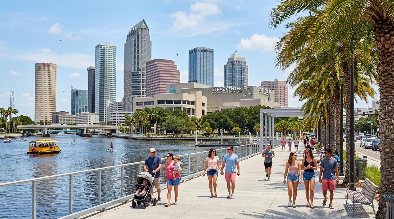
Whether you're grabbing dinner around Hyde Park, spending an afternoon near the Tampa Riverwalk, exploring Downtown St. Pete or heading toward the Gulf, there are plenty of places around Tampa Bay to spot color inspiration in real life.
And while we usually talk about homes and neighborhoods at Frank Albert Realty, sometimes a trend is simply too good not to talk about. 🎨🌴
👀 So, Which 2026 Color Are You?
Maybe you're Midnight Espresso all the way.
Maybe Dusty Rose already has your name written all over it.
Or maybe you're looking at this entire list thinking, "I'll stick with black." 😂
Either way, that's what makes the trending colors of 2026 interesting. There's no single shade everyone has to wear, decorate with or build an aesthetic around.
The real trend is finding new ways to combine colors you might have overlooked before.
And now that we've covered the colors and combinations, there's one question left:
Which one is actually taking the crown for 2026? 👀
🔍 Frequently Asked Questions About 2026 Color Trends
Still trying to figure out which shade deserves a spot in your closet, nail appointment or next Pinterest board? Here are some of the biggest questions around 2026 color trends.
What colors are trending in 2026?
The trending colors of 2026 include a mix of warm neutrals, earthy greens, muted pinks, creamy whites and rich browns. Our palette highlights Velvet Beige, Dusty Rose, Mocha Brown, Cream Latte, Soft Olive, Cocoa Sand, Warm Taupe, Midnight Espresso, Blush Nude and Ivory Glow.
Major fashion forecasts support that broader direction. Pantone's Spring/Summer 2026 New York Fashion Week report includes shades such as Dusty Rose, Coffee Bean, Angora, Sage Green and White Onyx.
What is the biggest color trend of 2026?
Rather than one color dominating everything, warm and earthy shades are one of the clearest themes of 2026.
Brown is especially hard to ignore. From lighter cocoa shades to deep espresso brown, it's appearing alongside cream, beige, muted pink and green instead of simply functioning as a background neutral.
Is brown still trending in 2026?
Yes. Brown continues to have a strong presence in 2026, and Pantone's Spring/Summer 2026 fashion report includes Coffee Bean, a deep roasted brown.
We're seeing the brown family stretch from lighter shades such as Cocoa Sand to deeper Mocha Brown and Midnight Espresso, making it one of the easiest trends to adapt to different styles.
What pink is trending in 2026?
Dusty, muted pinks are worth watching.
Pantone specifically included Dusty Rose in its Spring/Summer 2026 New York Fashion Week palette. Softer shades like our Blush Nude also fit naturally alongside the warmer neutrals featured throughout this year's palette.
What colors go well together in 2026?
Some of our favorite 2026 color combinations include Dusty Rose + Soft Olive, Mocha Brown + Cream Latte, Blush Nude + Midnight Espresso, Velvet Beige + Soft Olive, and Ivory Glow + Midnight Espresso.
The trick isn't necessarily choosing the trendiest two colors. Pick shades that create the amount of contrast, softness or warmth you actually like.
🎨 So, What Color Is Winning 2026?
After ten colors, countless combinations and enough coffee-inspired names to make us want a latte 😂, picking one winner isn't easy.
But maybe that's the point.
The biggest color trends of 2026 aren't asking everyone to suddenly wear the exact same shade.
This year's palette gives you options.
Want something soft? Dusty Rose or Blush Nude.
Prefer neutrals? Velvet Beige, Cream Latte or Warm Taupe.
Want something earthy? Soft Olive.
Ready to go darker? Mocha Brown or Midnight Espresso.
And if you're refusing to give up white? Ivory Glow has entered the chat. 🤍
The easiest way to try a trend is also the simplest: start with the color you genuinely like.
A manicure. A handbag. A pair of shoes. Flowers. An invitation. An outfit.
You don't need to rebuild your entire aesthetic because the internet decided a new color is cool.
2026 gave us the palette. What you do with it is the fun part. 🎨
💬 Now we want to know: which of the 10 colors are you claiming for 2026?
🌴 Colorful Trends. Colorful City. Plenty More to Explore.
Color inspiration can come from anywhere, and around Tampa Bay, there's plenty of it.
From sunsets over the Gulf and murals around St. Pete to the architecture, restaurants, shops and waterfront spaces throughout Tampa, style is only one part of what makes exploring the area interesting.
And if all this talk about what's trending has you curious about what's happening in Tampa Bay real estate, that's where we come in.
Contact Frank Albert Realty for help exploring Tampa Bay homes. Whether you're buying, selling or simply curious about the market, our team is here to help you make your next move. 🏡🌴

Now that you know the colors of 2026… good luck not noticing them everywhere. 👀🎨😂